


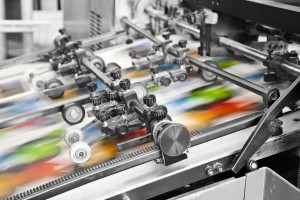
Here are four tips to follow when you’re designing your files for commercial printing.
When you decide to have a project commercially printed, it’s usually because you want it to look perfect. You want a professional finished product. The trouble is that even the best printers can’t perform miracles, and if the file and design have issues the product still won’t look professional. Here are four tips to follow when you’re designing your files for commercial printing.
Fonts
If you’re creating your file using the standard fonts that come in Word or Publisher or the Adobe suite, your printer will have them also. But if you go out and buy (or find) specialty fonts, you will need to send the font files to the printer. Without them, the printer will open the file and see gibberish, or the font will be automatically switched to a stock font, and you won’t get the look you want. If you’re working with a program like InDesign, you can let the program package out the fonts with the file and send them all together.
Images
If you’re using images in your project, make sure that they are high resolution. A good tip is that images should be at least 300 dpi. If you’re using a digital camera, the images should be okay for most projects. If you’re scanning images, make sure to save them as TIF or EPS files (JPG and GIF formats will compress and possibly distort the images) at 300 dpi. Finally, if you want to use an image as a background, be careful that your text remains readable. Use a photo editing program to lighten the image considerably so that the text stands out. And remember that even with the image lightened, the smaller the text is, the harder it will be to read.
Color Conversion
When colors are displayed on a monitor, it uses the three colors Red, Green, and Blue (RGB) to create all of the other colors on the screen. In printing, on the other hand, inks come in Cyan (a blue color), Magenta (a red color), Yellow, and Black (CMYK), and combinations of these colors produce the rest of the colors. This is why people always say your product won’t look like it does on the screen. The best way to get as close to the screen as possible is to design your file using CMYK, so the colors don’t have to be converted by the printer.
Bleed
When sheets are printed, they come out larger than your dimensions and get cut down to their final size. If you have any images or design elements that you want to “flow” off of the page (go all the way to the edge), then they have to go past the edge in your file. This is called a bleed. Typically, printers want a 1/8 inch bleed on all sides. This way, there won’t be any unintended white borders if the cuts are off slightly.
Let Time Printers Help With Your Design
Whether you know already how your marketing materials should look or you want further advice, Time Printers is here to help. We service all of Baltimore, Hunt Valley, and Towson. Our team of professionals can tackle all of your questions. Give us a call at 410-566-3005 and be sure to follow us on Facebook, Twitter, Google+, Pinterest, and LinkedIn for tips and to see what we have been working on and what we can do for you.