


Unfamiliar with designing prayer cards? Don’t worry, we are here to help!
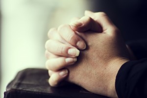
Funerals are always a hard topic to discuss. Even when you are in the midst of all-consuming grief, all you can do is keep going. As part of your preparations, you might be tasked with writing a moving obituary. Alternatively, your tribute could manifest in the form of a beautiful-looking prayer card. Unfamiliar with designing prayer cards? Don’t worry, we are here to help!
The Fundamental Elements of The Card
All prayer cards have three standard components: a spectacular photo, a digital image of the picture, and a fantastic design that can capture the spirit of your lost loved one and tie the entire creation together. Don’t hesitate to collaborate with your friends and partners here at Time Printers – that way, you won’t have to go it alone!
Getting the Best Photo
As we said, photographs are the single most important part of any prayer card. This step is where the fun begins because you can exercise your creativity. Carefully narrow down your options for the most appropriate background. Likewise, figure out the colors that you are looking to include. Another aspect of prayer cards to consider is how you can get the best lighting that will astound your guests and if you are in charge of a house of worship, your congregants as well. We suggest that you get your pictures done in the late afternoon.
Finding the Right Location for a Photo
Choosing the location for your prayer card photo is no small feat. Think about your ministry’s type of vibe – or your church or synagogue or mosque projects in serving its surrounding communities. Impressive landmarks, spectacular architecture, and gorgeous landscape views are all fantastic ways to take your next set of prayer cards to another level.
Deciding on the Proper Background
You may have noticed that we previously mentioned the background used for your cards. Using textboxes or adding frames to the photo decrease the necessity of even using a backdrop. However, the colors of the text and logo you want to embed in the image will make a massive difference – so proceed with caution! Choosing a sensible contrast will help make the text more legible and easy to read – for example, put dark text against a light background.
Let Time Printers Assist You with Your Upcoming Printing Needs for 2021!
Whether you know already how your latest print products should look or you want further advice, Time Printers is here to help! We service all of Baltimore, Hunt Valley, and Towson. Our team of professionals can tackle all of your questions. Give us a call at 410-566-3005, and be sure to follow us on Facebook, Twitter, Pinterest, and LinkedIn for tips and see what we have been working on and what we can do for you. We hope to hear from you soon!
Tags: funeral, funeral printing, prayer cards