That said, if you are confused about your options for how to design birthday cards, you’ve come to the right place. We have some fabulous tips for you to follow!
Amidst this era of quarantine and self-isolation, it can be harder to keep up with everyone in your circle of friends and family. Let’s say that a special birthday is coming up – every birthday is a special occasion, no matter which milestone someone is reaching – but it’s tough to plan even a small gathering because of present circumstances. That said, if you are confused about your options for how to design birthday cards, you’ve come to the right place. We have some fabulous tips for you to follow!
Make Use of Brighter Colors
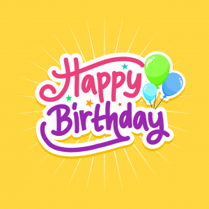
Everyone likes bright colors! And a birthday party is a ray of light even when everything seems gloomy. That’s why you can and should make use of brighter colors when you are designing your next batch of birthday cards. Combinations such as blue and teal, orange and red, and blue and pink are all eye-catching examples of ways to help make your card stand out. After all, greeting cards aren’t much use if they don’t capture your audience’s attention!
Try Merging Different Font Styles Together
Never underestimate the effect of what font styles can do. Fonts make a difference in anything you can print – such as handwritten pieces of paper, important documents, marketing materials, even homework. You might not have thought of merging different font styles together before, but doing this can also make your set of birthday cards look even more impressive.
Ensure the Header is Attention-Grabbing
Headers and footers often draw the other to certain sections of whatever printed material you expect your reader to follow – the same is true of books, graphic novels, newspapers, and greeting cards and brochures. So when you go to outline what your newest collection of birthday cards looks like, ensure that the header is engaging.
Experiment with Color Filters
The proper use of color makes a tremendous difference. That’s why you should think about experimenting with various color filters. Color filters help make the text easier to read without hiding the image that you’ve used as the background for the card that you are creating. The easier your card is to read, the more likely that the info you enclose within it will be read and appreciated – whether it’s for a simple greeting containing warm-wishes or setting up a virtual party or one planned with social distance measures well-enforced.
Base Your Design Around a Focal Point
Designing your newest birthday card doesn’t need to be a daunting task. If you base it around a focal point, such as a particular image that encapsulates the spirit of the card, then you are in good shape. Where does everything line up and converge? Think about the theme of the card – a sports ball, a planet, or a music note – all of these can be useful focal points.
Let Time Printers Help With Your Design
Whether you know already how your marketing materials should look or you want further advice, Time Printers is here to help. We service all of Baltimore, Hunt Valley, and Towson. Our team of professionals can tackle all of your questions. Give us a call at 410-566-3005 and be sure to follow us on Facebook, Twitter, Pinterest, and LinkedIn for tips and to see what we have been working on and what we can do for you.